The ideal vaping website - tips from the community

Silver

Flavour and throat hit seeker
Staff member
Administrator
ECIGSSA Donor
VIP
LV
63
 
Joined
16/11/13
Posts
43,440
Awards
50
Location
Joburg
There's been quite a lot of talk in another thread about what irritates us when using various vaping websites.

So lets drop our comments here and give some tips to our vendors on how they can improve things
What irritates you?
What do you like?
How can things be improved?

If we speak up here and vendors take note, it could be a win win for all

Putting this in "Who has stock" so vendors can discuss openly if they choose to
 
Last edited:
Here are my comments

I don't like
  • popups, especially those that say who bought what. (Vape cartel, vape king, eciggies come fo mind)
  • Too much activity or moving parts
  • Complicated checkout procedures
  • When you have to click on a juice to find out the bottle size. Man, just put that in the product index!!

I do like
  • Clear picture, product name and price
  • Good search function

Thats a start...
 
Last edited:
I would really like the option to filter out stock that is currently out of stock. I appreciate why the vendors may want to leave those items in, sometimes I want to see what I can get right now.

Sites that list each colour variant as a different product. nuh-uh. My budget may be minor, but that just chases me away.
If something is out of stock (and I've opted to see out of stock items) an honest albeit rough idea of arrival would be good. Foreign suppliers, transport companies and customs will make any prediction unreliable, but to know that you've placed and order for more stock or that your order is in transit would be good.

Have whatever cool/funky design elements you want, I don't care, as a child of the internet era I'm pretty good at ignoring that noise, until it gets between me and the actual content I'm looking for. 'Piet Poffader in Welkom bought a SM25'? Great for Piet, but what is the minimum acceptable resistance for this R1500 mod I'm considering buying, the details of which are obscured by Pieties purchasing preferences.

Pictures. The gallery widgets these days allow many many pictures to be loaded. Don't just rely on Manufacturer images, take your own. In high resolution. I like to zoom in, lots. Take different angles.


-----
Excellent thread @Silver, looking forward to what suggestions and comments come out of this.

Thanks @craigb

Excellent post by you there. Loved that link for taking your own images. I agree, good photos are very important.

Lets see how this thread develops...
 
There's been quite a lot of talk in another thread about what irritates us when using various vaping websites.

So lets drop our comments here and give some tips to our vendors on how they can improve things
What irritates you?
What do you like?
How can things be improved?

If we speak up here and vendors take note, it could be a win win for all

Putting this in "Who has stock" so vendors can discuss openly if they choose to
Great thread @Silver. I will however need a decent size screen and physical keyboard to respond adequately.

Regards
 
PS - i know exactly what @Rob Fisher is going to say
 
Here are my comments

I dont like
  • popups, especially those that say who bought what. (Vape cartel, vape king, eciggies come fo mind)
  • Too much activity or moving parts
  • Complicated checkout procedures
  • When you have to click on a juice to find out the bottle size. Man, just put that in the product index!!

I do like
  • Clear picture, product name and price
  • Good search function

Thats a start...

Noted ;)

We have updated a couple of the pop up settings to make this a lot less in your face :)

One small thing though - the bottle sizes
Unfortunately for some juices that there are multiple sizes it becomes very messy and also to condense the descriptions to 1 single line with the bottle sizes is neigh impossible. The site looks incredibly messy with single and dual line descriptions and none of the products flow from one to the next :)
 
You guys pretty much summed it up for me.

Bad idea:
- Popups (They wont admit this, but its not always a 'Live' representation, its a psychological sales tactic thing to get consumer more eager to make a decision to buy something, much like a auction, so people buy because of FOMO if they see there are 2 left and Jan just took one)
- Different pages for the same thing
- Different page for different ML juices
- Weird hidden difficult to navigate menus
- Having too many Categories
- No Image for product available
- No stock that is still displayed
- Dead links
- One page for all products

Good Idea:
- Clear and Various Images of the actual product, Like Sir Vape (Not supplier images)
--- Especially on things like Stab Wood and resin Mods (I like how Sir Vape lists These)
- Simple Navigation (Clyrolinx and Vaporize.coza Site is a bit Hide and Seeky, difficult to find things)
- Loyalty points (That are actually worth something)
- Filters to better define results
- Clear contact details and location, Not a webform that I have to fill in and hopefully get a call
- Up to date (Remove old keep new updated)
- SUPPORT THE PRODUCTS YOU SELL. For instance if I buy a tank from you with prebuilt coils, then I would like to be able to get a replacement coil from you for at least 12 months after purchase. Dont sell things that are discontinued

So yeah, basically everything everyone said.

And thats my
1*VM4QgVeRrlBxGyvk4F1snw.png
 
Last edited:
Noted ;)

We have updated a couple of the pop up settings to make this a lot less in your face :)

One small thing though - the bottle sizes
Unfortunately for some juices that there are multiple sizes it becomes very messy and also to condense the descriptions to 1 single line with the bottle sizes is neigh impossible. The site looks incredibly messy with single and dual line descriptions and none of the products flow from one to the next :)

Not impossible. I am sure you can make a plan. I used to work as a products administrator - there's short descriptions and long descriptions as an option.

With multiple sizes, you could opt for a drop menu for those to choose from. Blck Vapor does this.

Just my opinion as a former administrator
 
Pictures. The gallery widgets these days allow many many pictures to be loaded. Don't just rely on Manufacturer images, take your own. In high resolution. I like to zoom in, lots. Take different angles.

Yes, yes and YES to this!
 
Not impossible. I am sure you can make a plan. I used to work as a products administrator - there's short descriptions and long descriptions as an option.

With multiple sizes, you could opt for a drop menu for those to choose from. Blck Vapor does this.

Just my opinion as a former administrator

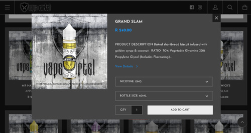
We have already consolidated all size and colours into single products - as an example Mr Hardwicks Grandslam. We offer these in 60ml and 120ml
Both sizes and nicotine strengths are found in the product itself and on the quick buy pop up on our site :)
What I was saying that is not an option for us right now is to put the 60ml and 120ml into the Product Name on the site :)
 
Great thread @Silver

I like:
- Detailed pictures - I want to see in detail what I want to buy
- Stock availability (QTY)
- a good search function - preferably with advanced options (where I could for instance select brand, product category, etc.)
- Easy navigation/filtering (possibly product category, price range, brand, etc.)
- Clear and easy to find shipping policy
- sites that can automatically determine if I am on my mobile or Desktop and display accordingly in a suitable manner
- Related items OR "You might also be interested in..." - so that I do not forget to get the extras that I would need when I buy a specific product.

It would be nice to have these additional features, but I'm not going to ignore your site if you don't have it:
- links for additional information like reviews, manufacturer site product details, etc.
- a loyalty program that have reasonable rewards
- a news letter subscription option - then I can get information without having to constantly come back to your site
- XXX R to go to qualify for free shipping - saves me from having to calculate in my head all the time


I do not like:
- Pop-ups - I am not interested in who bought what, when and from where - it only distract from my shopping experience. If you really want to share that with me, share the information you want to on the item detail rather where I can have the choice to look at it if I want to - but please give me the choice - don't throw it in my face - I'm sensitive :)
- "What is new" or "New Arrivals" section with products that was obviously a new many moons ago. Maybe implement a filter so that I can specify how new or just include items from the last month


And let's hope that vaping web sites will still exist when the minister is done with us .
 
Agree with all the above just want to add 1 thing - although some sites have to many categories, some lists everything other than Mods and Atties under "Accessories". Going through pages of kangertech and smok etc. coils when looking for wire or cotton is annoying.
 
From a DIY point of view, I don't need to see a picture of the bottle of flavour I want. I don't need to read the manufacturer's description or reviews of the flavour. I'm buying it because experienced DIYers have recommended it or used it in recipes I want to try, or I'm restocking a flavour I already have and know. So I arrive on the site with a clear idea of what I want. If I want to start by getting TFA Bavarian Cream, I don't want to open the first TFA page, click on the Bavarian Cream graphic, go to the Bavarian Cream page, click on Add To Cart, have a pop-up showing me that 10ml Bav Cream is now in my cart, click on the screen to cause that pop-up to disappear, click on Back to get from the Bavarian Cream page back to the TFA page, and then have to repeat this whole process with every flavour I buy. I want a mechanism where I can immediately add it to my Cart.

In this regard, massive shout-out and thanks to @Richio. When I arrive at Blck to add TFA Bavarian Cream to my cart, I see this:

blck1.jpg

When I click on the blue and white cart icon, it expands to show me the volume options for that flavour, thus:

blck2.jpg

When I select an option, it gives me an unobtrusive but clear notification in the bottom right corner of the screen, thus:

blck3.jpg

That is all I need. It makes navigating a breeze because I'm not constantly having to load individual flavour pages, constantly having to hit the Back button when I'm done adding the flavour, constantly having to close Cart pop-ups. I go through quickly, adding the flavours as I check them off my list. When I'm done, I open the Cart page, a quick double-check confirms that I've got what I set out to buy, and I proceed to checkout. Done and dusted.

Of course, if I want to load the individual flavour pages and look at the pictures and read the descriptions, I can still do so. But Richio adds the short-cuts to make things a lot quicker and easier for those of us who know what we want and don't need to faff around. It is a fantastic interface that is really user-friendly.
 
We have already consolidated all size and colours into single products - as an example Mr Hardwicks Grandslam. We offer these in 60ml and 120ml
Both sizes and nicotine strengths are found in the product itself and on the quick buy pop up on our site :)
What I was saying that is not an option for us right now is to put the 60ml and 120ml into the Product Name on the site :)

Ah yes the naming convention / product title. Yeah you will be restricted by that. Usually that happens.
 
1) No pop-ups!

2) Juice should be categorised according to flavour profile. (See Drip Society's well-organised website for a good example. @Cruzz_33. I don't want to waste time scrolling through everything, when I'm looking for something in the Bakery line.

3) List new arrivals separately. By "new" I mean the past few weeks or so. The Vape Industry's website gives a good example of new arrivals @Naeem_M. On the other hand, there's a vendor whose "Just Arrived" section consists of 80 pages. Clearly they are not all new!

4a) ALL info about the juice must be there without having to click to go to another page.
When I say ALL info I include:
Flavour description
Nic strengths available
VG/PG! Many vendors do not state this on the website. Why not? As consumers we have the right to know what we are ordering.
Bottle size available
Price

4b) For International Juice, the country of origin should be stated. It makes it interesting.

5) The website must be kept up to date regarding what is in stock. It's frustrating and disappointing to receive a phone call the next morning informing you that an item which you ordered, and was not marked as being out of stock on the website, is out of stock.

6) All vendors should offer loyalty points and it must be easys to find out how the loyalty system works.
How many loyalty points do I receive for every Rand spent? What is the conversion of loyalty points to Rands? Do 10 points = R10?

7) Suggestion: Offer a birthday voucher to customers who have spent a minimum of X amount over the past year.

8) Suggestion: Offer Snapscan or Zapper as payment options. These are the "modern" way of paying and it's sooooooo much easier than PayGate etc.

EDIT: The minimum expenditure required for free shipping should be reasonable e.g. R500. Some vendors have a minimum expenditure of R1,000 or R1,500 which is unreasonable!
 
Last edited:
"Add to cart" in searched items without having to go to the actual product.

Bad: When clicking on "Add to cart" and it takes you to the cart. Why? I'll go to my cart when I check out. Now I have to go back to my search page after every click on "Add to cart". It is obvious that vendors do not buy from themselves online, otherwise they would've known how irritating this is.
 
1) No pop-ups!

2) Juice should be categorised according to flavour profile. (See Drip Society's well-organised website for a good example. @Cruzz_33. I don't want to waste time scrolling through everything, when I'm looking for something in the Bakery line.

3) List new arrivals separately. By "new" I mean the past few weeks or so. The Vape Industry's website gives a good example of new arrivals @Naeem_M. On the other hand, there's a vendor whose "Just Arrived" section consists of 80 pages. Clearly they are not all new!

4a) ALL info about the juice must be there without having to click to go to another page.
When I say ALL info I include:
Flavour description
Nic strengths available
VG/PG! Many vendors do not state this on the website. Why not? As consumers we have the right to know what we are ordering.
Bottle size available
Price

4b) For International Juice, the country of origin should be stated. It makes it interesting.

5) The website must be kept up to date regarding what is in stock. It's frustrating and disappointing to receive a phone call the next morning informing you that an item which you ordered, and was not marked as being out of stock on the website, is out of stock.

6) All vendors should offer loyalty points and it must be easys to find out how the loyalty system works.
How many loyalty points do I receive for every Rand spent? What is the conversion of loyalty points to Rands? Do 10 points = R10?

7) Suggestion: Offer a birthday voucher to customers who have spent a minimum of X amount over the past year.

8) Suggestion: Offer Snapscan or Zapper as payment options. These are the "modern" way of paying and it's sooooooo much easier than PayGate etc.

EDIT: The minimum expenditure required for free shipping should be reasonable e.g. R500. Some vendors have a minimum expenditure of R1,000 or R1,500 which is unreasonable!

Great comments @Hooked
On the point of all that info available on a juice, I agree 100%

Several years ago, we asked vendors to have one page on their website with all this info listed in a tabular format. No need for pics, just so you can at a glance see all the juices available with all the info. Im not sure if this is possible with the online shopping software that vendors use, but it would be a major win if you could see juices available on one page. With one liners describing their flavour of course (as well as bottle size & price).
 
Last edited:
Great comments @Hooked
On the point of all that info available on a juice, I agree 100%

Several years ago, we asked vendors to have one page on their website with all this info listed in a tabular format. No need for pics, just so you can at a glance see all the juices available with all the info. Im not sure if this is possible with the online shopping software that vendors use, but it would be a major win if you could see juices available on one page. With one liners describing their flavour of course (and price).

@Silver Excellent idea about the tabular format and one-liners. All that one really needs to know are the basic ingredients e.g. papaya, pineapple, coconut, cream. We don't need an entire paragraph describing how we'll watch the sunset on a tropical island.

All this unnecessary "stuff" wastes time and data.
 
Back
Top