Navigation
Install the app
How to install the app on iOS
Follow along with the video below to see how to install our site as a web app on your home screen.

Note: This feature currently requires accessing the site using the built-in Safari browser.
More options
You are using an out of date browser. It may not display this or other websites correctly.
You should upgrade or use an alternative browser.
You should upgrade or use an alternative browser.
Newlook For Ecigssa
- Thread starter Rob Fisher
- Start date


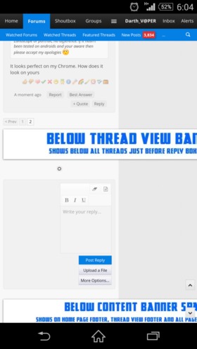
The new format isn't bad at all, modern and we'll spaced. I can most certainly tell you is definitely hasn't been formatted for the Android (Chrome) users though, everything is out of proportion. Landscape or portrait, no difference. If it hasn't been tested on androids and your aware then please accept my apologies
It looks perfect on my Chrome. How does it look on yours

Those banners will be responsive. Just give me time
Sent from my SM-G900H using Tapatalk
Sent from my SM-G900H using Tapatalk

I'm playing around with Stylish here, and "Open Sans" just looks incredible on here.
http://www.1001fonts.com/open-sans-font.html
Anyone looking to see it on here download "Stylish" (It is used override the CSS styles of any page). from one of the following links
1. Firefox Users - https://addons.mozilla.org/en-US/firefox/addon/stylish/
2. Chrome Users - https://chrome.google.com/webstore/detail/stylish/fjnbnpbmkenffdnngjfgmeleoegfcffe?hl=en
@-moz-document url-prefix("http://www.ecigss.co.za") {
.messageText {
font-family: "Open Sans";
font-size: 1.1em;
color: black;
}
.bbCodeBlock pre, .bbCodeBlock .code {
font-size: .68em; /* 10pt default =~ .68em (I prefer em sizing) */
}
}
Screenshot of Stylish

6. Click the save button
http://www.1001fonts.com/open-sans-font.html
Anyone looking to see it on here download "Stylish" (It is used override the CSS styles of any page). from one of the following links
1. Firefox Users - https://addons.mozilla.org/en-US/firefox/addon/stylish/
2. Chrome Users - https://chrome.google.com/webstore/detail/stylish/fjnbnpbmkenffdnngjfgmeleoegfcffe?hl=en
- Click Stylish button
- Click "Write new style"
- Click "Blank style..."
- In the "Name" field type Ecigssa Forum
- In the code box below the "Insert" button, paste the following in blue...
@-moz-document url-prefix("http://www.ecigss.co.za") {
.messageText {
font-family: "Open Sans";
font-size: 1.1em;
color: black;
}
.bbCodeBlock pre, .bbCodeBlock .code {
font-size: .68em; /* 10pt default =~ .68em (I prefer em sizing) */
}
}
Screenshot of Stylish
6. Click the save button
Last edited:
I opened the site from my bookmarks....and for a moment I wasn't sure if I was logging into the correct site lol....but hey! I think it looks gr8 - love it! .... I work on excel all day, and the look kinda reminds me of the latest version of microsoft office....makes me feel right at home.
Let me put it to the test.

I only have these tho
theme_xenforo_fonts : "Andale Mono=andale mono,times;Arial=arial,helvetica,sans-serif;Arial Black=arial black,avant garde;Book Antiqua=book antiqua,palatino;Courier New=courier new,courier;Georgia=georgia,palatino;Helvetica=helvetica;Impact=impact,chicago;Tahoma=tahoma,arial,helvetica,sans-serif;Times New Roman=times new roman,times;Trebuchet MS=trebuchet ms,geneva;Verdana=verdana,geneva",
theme_xenforo_fonts : "Andale Mono=andale mono,times;Arial=arial,helvetica,sans-serif;Arial Black=arial black,avant garde;Book Antiqua=book antiqua,palatino;Courier New=courier new,courier;Georgia=georgia,palatino;Helvetica=helvetica;Impact=impact,chicago;Tahoma=tahoma,arial,helvetica,sans-serif;Times New Roman=times new roman,times;Trebuchet MS=trebuchet ms,geneva;Verdana=verdana,geneva",
I only have these tho
theme_xenforo_fonts : "Andale Mono=andale mono,times;Arial=arial,helvetica,sans-serif;Arial Black=arial black,avant garde;Book Antiqua=book antiqua,palatino;Courier New=courier new,courier;Georgia=georgia,palatino;Helvetica=helvetica;Impact=impact,chicago;Tahoma=tahoma,arial,helvetica,sans-serif;Times New Roman=times new roman,times;Trebuchet MS=trebuchet ms,geneva;Verdana=verdana,geneva",
Verdana looks good too.
I used the Style Editor in Firefox to see what the 'New Posts" font is -
@font-face {
font-family: 'Open Sans';
font-style: normal;
font-weight: 700;
src: local('Open Sans Bold'), local('OpenSans-Bold'), url(http://themes.googleusercontent.com...702ZOKiLJc3WVjuplzHhCUOGz7vYGh680lGh-uXM.woff) format('woff');
}
Last edited:

I have a feeling the font on our previous version of the forum before these changes was "Georgia" ?
When I copied and pasted something into a Word document previously from the forum it was registered as Georgia font on MS Word. Not sure if it took the font as well, but I pasted it as HTML
TImes New Roman and Georgia are both Serif fonts

I found this image on Google Images when I was trying to see what Georgia looked like...
When I copied and pasted something into a Word document previously from the forum it was registered as Georgia font on MS Word. Not sure if it took the font as well, but I pasted it as HTML
TImes New Roman and Georgia are both Serif fonts
I found this image on Google Images when I was trying to see what Georgia looked like...
This font decent?
This font decent?
This is a definite improvement from around two hours ago. Tested with Chrome, Firefox and Opera.
Previously was legible to me but seemed a bit light.
New look is awesome btw and I just discovered the hover text on the forums menu/front page, brilliant !!
This font decent?
Jip Jip I like it
still liking old style better....maybe its just me not liking changes
Old fart
lol ... pipsqueak!Old fart
Just make the font in a darker black or bold
Prefer old font or I need to go and make an appointment with an optometrist.
Ditto
Just make the font in a darker black or bold
Have you calibrated your monitor ?
http://www.lagom.nl/lcd-test/
http://www.makeuseof.com/tag/5-online-tools-calibrate-monitor/
The font is super readable now
Yes it is! Thanks Gizmo!The font is super readable now

Similar threads
- Replies
- 0
- Views
- 260