WE NEED YOUR HELP .......

VanillaVape

New Vaper
Supporting Vendor
LV
14
 
Joined
5/3/19
Posts
90
Awards
12
Age
43
Location
21 O.R Tambo Rd
Hi Vape Fam

we need your help , we are almost done loading our website and we need your feedback.
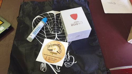
For 1 lucky person he could walk away with a VGOD pro 200 kit.
Its simple visit our site www.vanillavape.co.za subscribe to our mailing list ,go to the contact tab at the bottom leave us a massage of what changes we can make to our site
We will randomly select a winner from all the input we receive .
winner will be announced here on the 30th of April 2019
https://www.vanillavape.co.za/
 
@VanillaVape Since you're a registered vendor on the forum, you may not promote your business in other threads, so I've taken the liberty of posting your giveaway in the Giveaway Participation thread. https://www.ecigssa.co.za/giveaway-participation-and-notification-thread.t42885/page-28

There are many people who might miss individual posts, but they follow that Giveaway thread.

While I'm here, I'd just like to say that I love vaping vanilla, so I love your name! Wishing you all the best for your new venture.:banana:
 
Hi @VanillaVape

Congrats on the website

Here are my comments and some observations thus far:

The age verification output is cool that it shows you your age - but I dont think that is really necessary. It just puts an extra something between a potential customer and getting to the products online. A person knows their age, so it doesnt really add much value.

Products look good with clear descriptions and prices. I like how the juices show the bottle sizes and nic strength in the index pages. Its clear.

I think you should link your ECIGSSA Supporting Vendor badge to your subforum here on ECIGSSA:
https://www.ecigssa.co.za/forums/vanilla-vape/

When I look at tanks & rtas, it has the berserker MTL RTA at the end - despite it being a new arrival. Surely new arrivals should be at the beginning of the product index for that category?

When you click the "Click Here to Enter" button on the home page it has a popup that has info from San Francisco etc. It says Holler at us. That probably needs to be changed to your details.

Just an observation, your website and company is Vanilla Vape. Yet the logo looks like it says Vanilla Vapes
With the "s" on the end.

The JEL Havana 60ml looks like Havana Cherry to me (in the picture). Other strengths have Havana Cherry in the title but some just say Havana.
https://www.vanillavape.co.za/product-page/jel-havana-60ml-3mg-1

Hope some of those comments can help you
All the best with the website

Rather leave my name out of the competition so that other members are eligible. Nothing against you or the competition, I would just rather someone else win than me - given my role here on the forum...
 
Last edited:
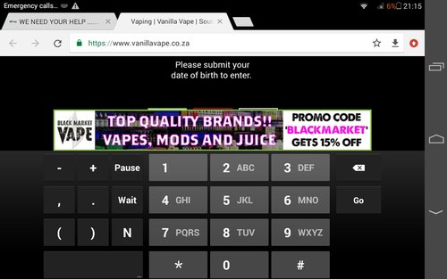
I dont like it if I have to start entering birthday etc just to enter a site. A simple yes Im older than 18/21 button is much easier and faster. I would have liked to send you this opinion through the messages on your site but after getting this on a tablet I decided that typing where I cant see is only possible after half a bottle Klippies
Screenshot_2019-04-08-21-15-35.jpeg
 
Hi @VanillaVape

Congrats on the website

Here are my comments and some observations thus far:

The age verification output is cool that it shows you your age - but I dont think that is really necessary. It just puts an extra something between a potential customer and getting to the products online. A person knows their age, so it doesnt really add much value.

Products look good with clear descriptions and prices. I like how the juices show the bottle sizes and nic strength in the index pages. Its clear.

I think you should link your ECIGSSA Supporting Vendor badge to your subforum here on ECIGSSA:
https://www.ecigssa.co.za/forums/vanilla-vape/

When I look at tanks & rtas, it has the berserker MTL RTA at the end - despite it being a new arrival. Surely new arrivals should be at the beginning of the product index for that category?

When you click the "Click Here to Enter" button on the home page it has a popup that has info from San Francisco etc. It says Holler at us. That

probably needs to be changed to your details.

Just an observation, your website and company is Vanilla Vape. Yet the logo looks like it says Vanilla Vapes
With the "s" on the end.

The JEL Havana 60ml looks like Havana Cherry to me (in the picture). Other strengths have Havana Cherry in the title but some just say Havana.
https://www.vanillavape.co.za/product-page/jel-havana-60ml-3mg-1

Hope some of those comments can help you
All the best with the website

Rather leave my name out of the competition so that other members are eligible. Nothing against you or the competition, I would just rather someone else win than me - given my role here on the forum...


Thank you for your feedback i really do appreciate it and will address everything to make it more user friendly.
 
Thank you everyone for your feedbacks I will take everyone’s suggestions into consideration and try my best to improve it to make it more friendly

Again thank you for the feedback we do appreciate it
 
Great to see that the website has gone through some good changes and that the feedback was helpfull!
 
Back
Top