Huge Juice & DIY Comp + Participation Discount!

YeOldeOke

Elite Vaper
Supporting Vendor
LV
32
 
Joined
25/3/16
Posts
1,751
Awards
28
Age
72
Location
Pretoria
logo.jpg

We have a special comp for this week.

For a start, the prize is doubled from our last competition.

This competition will run for a week.
The competition is open to all regular forum members, forum admin/staff and vendors are not eligible.
The winning post number will be decided by draw at random.org
This competition will close at midnight on Sunday 2 Dec 2018
Winner will be announced the following day.

Rules:

You are allowed one post per day (max 7 posts for the week)
Tag 2 friends in each post. (forum admin/staff and vendors are not eligible therefore shouldn't be tagged)
Comment on 1) what you like and 2) what you dislike about our website.
(This feedback/comments should not be about the products offered, but about the website experience.)
Comments don't have to be long stories, though we will appreciate it, can be one-liners.


Prize will be a choice of 8 x 30ml juices (0 to 6mg) in Chubby Gorilla bottles
OR 4 x 30ml Nic Salts juices (1 to 35mg) in Chubby Gorilla bottles
OR 4 x DIY One Shot premixed concentrates making 400ml Juice.

But wait! There's more! :D

Because we want the feedback on how you find our new website, the good and especially the bad/irritating, every post will qualify for a 5% discount voucher, so if you make 7 posts during the week, not only do you stand 7 chances of winning the prize of your choice, you will qualify for a 35% discount voucher on all our products!
This applies to everybody participating, not just the winner.


The prize for this competition is a choice of:

juicecomp.jpg
juicecomp2.jpg
Nuts'n'Stuff Ice Cream
Chilled Pineapple
Chilled Irish Cream
Chilled Liquorice
Strawberry Lemonade
Lychee & Pear
Chilled Grape
Strawberry Yogurt Panna Cotta

8 x 30ml juice in Chubby Gorillas (0 to 6mg)

OR

4 of the above in DIY one shots making 100ml juice each

OR

nsjuicecomp.jpg

Chilled Pomberry Cococream
Chilled Red Berries
Mint Choc Chip Ice Cream
Pineapple & Lychee

4 x 30ml Nic Salts in Chubby Gorillas (1 to 35mg)


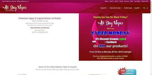
https://alldayvapes.co.za


Good Luck to all!
 
Last edited:
#1
1)I love the colours easy to read and go through.
2)I feel it’s time consuming scrolling through a list to choose flavours, a list with checkboxes option would make sorting and choosing easy!

Thanks for the comp!
@DieSwartKat
@Vape addict
 
Last edited:
#1

My first impression on going via the cellphone browser - looks really great. No complains here on the mobile side.

BUT however, there is a snag in the works. Going on my PC to view it and it's not that great. I presume that the site was made to adapt to cellphone screens but however, this is of my opinion as a former online e-commerce administrator, check here:
  • It's too wide with the two containers side by side. It doesn't look great with one that is white and the other with colour. My advice is to decrease the body width to 800px for PC screens only (from what I can remember in my former job, the most common screen sizes were from 10" up to 27" and I have a 23" LED myself). Then the side by side can stay in the middle centered. Just saying.
  • That font with the support email address and phone number with the menu options in the header container. There are a few people that can't see properly
    • #top-header, #top-header a, #et-secondary-nav li li a, #top-header .et-social-icon a:before {
    • font-weight: bold;
    • font-style: normal;
    • text-transform: none;
    • text-decoration: none;
    • letter-spacing: 0px; (it was previously -1px)
  • I use a code inspector and it does look better after testing it.
Other than the above 2, everything looks great to me. Easy to navigate on the home page.

For the first, just to give you an idea of what it actually looks like on my PC screen

ADV_website.jpg

@Room Fogger
@Braki
 
@Raindance @Puff the Magic Dragon
1) Like = Information at my fingertips with the 'E-Liquid Info' section.
2) Dislike = When going to the DIY ‘One Shot’ Premixed Concentrates I would like to see a clearer indication that the One Shot I am buying is 10ml, I know it says '10ml – Makes 100ml e-liquid' but it is not clear to me that I am buying 10ml. I would change to 'Above price is for 10ml and this makes 100ml e-liquid' or something of that nature.

PS - Going to be difficult to find 7 dislikes over the week :)
 
Pro: easy to use
: menu bar opens understandable and effecient tabs.

Cons: Would like to see an option to sort juices by flavor profile on the home screen as well, and not just in the menu.

Overall an easily maneuverable website though!
@JurgensSt
@Jengz
 
Last edited:
Thanks for all those contributing so far. I don't want to respond during the comp because my posts don't count :confused: and it will complicate the draw.

PS - Going to be difficult to find 7 dislikes over the week :)

@Bulldog If you run out of dislikes 'none' will do, if it's honest :D I'm really interested in the irritations/dislikes.

@RainstormZA the Cyber Monday banner comes off tonight, it's just a temp banner. Thanks for your detailed observations.

@Beserker786 @Seemo.wm You forgot to tag two friends in your posts.
 
Last edited:
Ok, browsing done and drooling.

Pro's:
Nice clear and uncluttered site. Menus are easy to use and good use of screen real-estate.
Plenty of information on the product and the DIY side of things.
No scrolly, popup or obstruction thingies that distract or hide what one is looking for.

Con's:
Really had to dig for this one but I think it is a valid issue.
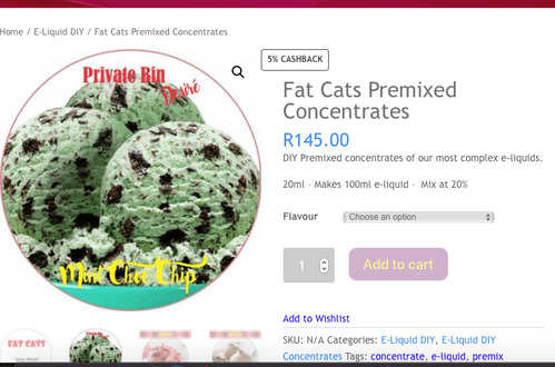
The one shot selection opens a "menu" where one can select between "Fat Cats", "Private Bin", "Signature" and "All day Vapes" categories. When selecting "Fat Cats" the following screen opens:
Screenshot 2018-11-26 at 21.12.26.png
However, here I am offered "Fat Cats" but also from the other lines such as in the example above. Confusing as I can not figure out what is "Fat Cats".

Not exactly site layout related but more of a content issue.

@Dietz
@MrGSmokeFree

Regards
 
Pro's
Very user friendly website. Love the pics, if you don't feel like reading :--)you can just check out the pics and get the idea what the flavour profile is. I spot tobacco juice Mmmmmmm.:babeando::SimpHomer:

Con's

Ummm, sorry none.

@hot.chillie35 @Faiyaz Cheulkar
 
@Faiyaz Cheulkar @Dietz
1) Like = You can see shipping details from the go.
2) Dislike = The red star thingy on the shipping picture in the footer and sidebar. To me it would be smarter without.
free-shipping-R350.png
 
#2
major dislike for me.
The "reformulated", "nic salt" or "new" stickers are tacky and distracting and make the products look cheap.

juicecomp2.jpg
 
@Raindance @MrGSmokeFree

Pro :

Cheerful and fun colours . The names of the liquid tell you what is in it. I detest fancy names like Sun blast. Wtf is that.

Con :

The fonts used above the pics like "signature, chilled and private bin" are difficult to read and don't stand out clearly enough.
 
@Vaporator00 @Tashy
1) Like = Delicious Pictures.
2) Dislike = I would put the Signature and Private Bin e-liquid ranges under their own heading on the page and not mixed with the Standard range.
 
LIKE:
- The options available when I order, Its Highly customization down the what type of Bottle I want. Not that I dont see any where else!
- Easy To Navigate
- Loads of info on DIY for beginners on the website

DISLIKE:
- Landing/Home page is a bit cluttered, I would prefer if the landing/home page was on a Category listing or a "New Products" page instead.
- The Font and the Bubble/star bubble that is overlayed on the products make it look a bit ooold and Bleh, like dusty specials on stock that you cant move. In general I think there is a bit of a more modern style update needed across the websites theme. Things Like Font, Colors and Graphics on Products.
- As @lesvaches mentioned, the blue "+" overlay on the products do not serve a purpose so doesnt need to be there. If it was used correctly (by clicking on the "+" sign adds it into the cart without opening the entire product page) then Id agree to have it there.

@Tashy @Raindance
 
Last edited:
#2

Like

Easy to navigate drop-down menus

Dislike

Your shipping costs are great. This should be highlighted, not hidden away. There should be a substantial banner across the top highlighting your shipping prices. I stand to be corrected but yours may well be the lowest of all online juice shops in SA.

@Dietz @lesvaches
 
Back
Top