Last edited by a moderator:
Navigation
Install the app
How to install the app on iOS
Follow along with the video below to see how to install our site as a web app on your home screen.

Note: this_feature_currently_requires_accessing_site_using_safari
More options
You are using an out of date browser. It may not display this or other websites correctly.
You should upgrade or use an alternative browser.
You should upgrade or use an alternative browser.
Rob's Lounge
- Thread starter Rob Fisher
- Start date
It could be for me if I did Carp fishing... but only do bass. 
Fixed you photo to avoid anymore need for a neckbrace.
Fixed you photo to avoid anymore need for a neckbrace.
Thought for the day...
I wonder how many vendors realise how many sales they lose by not having a simple page with their juices and the descriptions done so you can see what the juice is about without having to click eight million times to find out!
Also large graphic backgrounds really suck!
I wonder how many vendors realise how many sales they lose by not having a simple page with their juices and the descriptions done so you can see what the juice is about without having to click eight million times to find out!
Also large graphic backgrounds really suck!
Thought for the day...
I wonder how many vendors realise how many sales they lose by not having a simple page with their juices and the descriptions done so you can see what the juice is about without having to click eight million times to find out!
Also large graphic backgrounds really suck!
I have tried to spread this word over the months Rob
I agree with you
One page, with all the juices and a short description of the flavour for each
I have tried to spread this word over the months Rob
I agree with you
One page, with all the juices and a short description of the flavour for each
I know!
You would think that when the esteemed Hi Ho took the effort to make a suggestion for increased sales that they would take it to heart!
I get the fact that a name like Strawberry Milkshake is no long cool and they have to make up a fancy name like Zeus's Thunder or Thors Sack, but the very least they could do is give us an Hi Ho One pager bottom line!
Lol. My flavours are too boring. Apple is appleI know!
You would think that when the esteemed Hi Ho took the effort to make a suggestion for increased sales that they would take it to heart!
I get the fact that a name like Strawberry Milkshake is no long cool and they have to make up a fancy name like Zeus's Thunder or Thors Sack, but the very least they could do is give us an Hi Ho One pager bottom line!
Sent from my SM-T535 using Tapatalk
Lol. My flavours are too boring. Apple is apple
That certainly works for me!
So who do I complain to ?
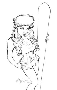
I came here to see pics of Rob's lounge and all I find is images of hot nubile chicks !
I came here to see pics of Rob's lounge and all I find is images of hot nubile chicks !
So who do I complain to ?
I came here to see pics of Rob's lounge and all I find is images of hot nubile chicks !
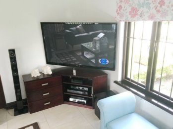
Sorry @daveza here we go... the first pictures of Rob's Lounge in Rob's Lounge!

Much better thank you.
Why do you have your own lounge on TV, and you really should paint those ornaments sometime.
PS: Now 18 hours without a stinkie so be nice.
PPS: Do you have pics of your lounge with some hot nubile chicks in it ?
Why do you have your own lounge on TV, and you really should paint those ornaments sometime.
PS: Now 18 hours without a stinkie so be nice.
PPS: Do you have pics of your lounge with some hot nubile chicks in it ?
Much better thank you.
Why do you have your own lounge on TV, and you really should paint those ornaments sometime.
PS: Now 18 hours without a stinkie so be nice.
PPS: Do you have pics of your lounge with some hot nubile chicks in it ?
I can't help myself, but I have to lay a wind egg:
TV Monitors does reflect light, especially when switched off.
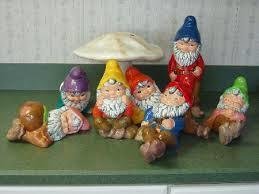
Not all people like to paint their ornaments like this:
PS. congratulations with the 18 hours so far, it seems the withdrawal is quite tough on you, just take it minute by minute.
Before your previous post, Rob's lounge was fully occupied with nubile chicks, I think they ran away.
They are the most amazing unpainted ornaments I have ever seen.
I know it's Easter coming up but I wish it was Xmas. 
I like the (s)trumpets!
I liked everything about the video! Even the music!
Thought for the day...
I wonder how many vendors realise how many sales they lose by not having a simple page with their juices and the descriptions done so you can see what the juice is about without having to click eight million times to find out!
Also large graphic backgrounds really suck!
This is a pet hate of mine too. I have resorted to opening up multiple tabs, one for each tab and then add to cart from there.
This is a pet hate of mine too. I have resorted to opening up multiple tabs, one for each tab and then add to cart from there.
I used to do that but now I get so irritable that I just leave...
Similar threads
- Replies
- 13
- Views
- 332
- Replies
- 1
- Views
- 125
- Replies
- 3
- Views
- 520
- Replies
- 0
- Views
- 97


