The Vape Den - Judge our website :)

So some more small updates to the site.

Firstly, I know it annoyed a lot of people that the "What's New" page on vendors websites are basically the entire catalog sorted.
Previously I stated that I need to do something custom to accomplish this. I now finally found a working solution. It's not yet perfect as it's only limited to 50 new products, currently this fits my needs as I do not have more than 50 new products currently. There are still bugs/issues to this.

For the technical savvy, or those curious
To accomplish this I had to modify the liquid file and have a look at each product, check the creation date via the json string, convert that to date, substract it from the current time stamp, and then convert it to days. So basically now while it loops through (as at time of writing this, 314 products) all products, it calculates the age, and if the age is within 30 days, it displays it, otherwise it continues the "for loop". This isn't perfect at all as I am now spending time calculating 314 products age, then discarding it from the results. The perfect solution would be to filter straigt on the json and discard products to to be displayed, and only then run the loop.

Now onto a new feature
Up until now I have only restocked items that were popular in the last 7 months of operation, due to the risk of oversteeping juices, however, my customer base is growing and changing by the day, so I need to keep p with new and old trends. Instead of completely removing it from the catalog I have implemented a "remind me when in stock" feature. This serves as 2 purposes, one, it lets me know what people want, and secondly, it notifies the subscriber immediately when in stock.

It looks as follows
View attachment 156359

The email field would obviously be auto populated.

Onto the third change
Another thing mentioned was stock on the site, this also I have said wasn't possible. However now I have been able to tap into some API's again to get the stock values passed all away from the inventory management to the frontend. Plans are to open a triangle of fullfilment centers in Gauteng (All ready open), Capetown, and Durban, so that same day deliveries are possible across the country. So this will be modified in the future to accommodate status per province.

Currently, You will either see a "In stock status", or when the quantity left is lower than 3, it will say how many is left, as per below:
View attachment 156362
or
View attachment 156363

I will also have this display the actual quantity on hand in the future, I really do not care if competitors know how much I have in stock, as they cannot do anything with that information.

Color Legends:
Done
Partially Done
To be done
  • Popups - disabled :)
  • Too much activity - Partially fixed. @Hooked mentioned that it does mess with the eyes when scrolling. Images have been made static now. Removing much of the moving parts. The only thing left now is the moving up add to cart button.
  • Clear pictures - Something major still coming :p
  • Filter out of stock - This will be coming soon
  • ETA's on stock - this is now visible even on the home screen and categories screen under the cart button. This is only applicable when stock has already been ordered :) For the rest there is the "notify me" button :)
  • Stock left - Also done now
So almost done with most of the issues :)

Thanks to everyone that has assisted me in this journey thus far!
Well Done!
Astonishing amount of work and effort to make your service excellent!
 
Pho3niX90 Just by the way the images of the juice are still moving (I'm on my laptop). As soon as the cursor is above an image, the image shifts up. Just to let you know ...

You are doing a tremendous job with improving things and taking people's suggestions on board!
 
Last edited:
Pho3niX90 Just by the way the images of the juice are still moving (I'm on my laptop). As soon as the cursor is above an image, the image shifts up. Just to let you know ...

You are doing a tremendous job with improving things and taking people's suggestions on board!
The image itself isn't suppose to move anymore. But will just have a look on myside. It could probably be some cache left int the browser
 
So just another small update. I have added some extra payment methods

Payments-Trimmed-only-100height.png
 
@Pho3niX90 does your site not need a Age Verification (no under 18’s)
I have contemplated this so many times. For me personally this is more of an irritation than anything else, besides if an under 18 y/o does enter the site, clicking yes doesn't feel much like a verification check.

I have tried finding any law that states that I must have this question posted to a visitor upon entry, but couldn't find anything! However for safety reasons all age verification is obviously done on order level.
Just to quote myself here.

AFAIK you have to have a site entry verification check done if you are going to display anything of a sexual nature (images), however not allowed to sell anything tobacco related (nicotine) to minors. Ergo the order verification step and not site wide.

If someone has more knowledge on this amd can shed some light. It would be greatly appreciated.

Also not sure if it’s a legal requirement, personally I can’t stand the age verification as you can simple lie and enter the site anyway.

If you are not bound by any S.A laws to have it then leave it off because it is a waste of time
 
Also not sure if it’s a legal requirement, personally I can’t stand the age verification as you can simple lie and enter the site anyway.

If you are not bound by any S.A laws to have it then leave it off because it is a waste of time
Most definitely.

Any laws I could find were USA related.
It seems there isn't even a law that side of the world to have age verification on alcohol websites or the likes, it was basically one site doing it, and the rest copying it. However, in doing that they are actually assisting minors in breaking the law if they were to lie about their DOB, as it's fraud. Even if only researching for a school research paper.

Source: https://www.huffpost.com/entry/liquor-website-age-verification_n_59c3b549e4b06f93538cdd18

https://www.foodandwine.com/article...ired-and-may-cause-more-harm-good-says-expert
 
I have contemplated this so many times. For me personally this is more of an irritation than anything else, besides if an under 18 y/o does enter the site, clicking yes doesn't feel much like a verification check.

I have tried finding any law that states that I must have this question posted to a visitor upon entry, but couldn't find anything! However for safety reasons all age verification is obviously done on order level.

It just covers your a.....

Actually I did come across the name of a USA site which requires a customer to upload a copy of their ID. It's still not foolproof though, because a minor could steal a parent's ID and photocopy it, but it does make it more difficult for minors to enter the site.

I would rather have the inconvenience of uploading my ID, than legislation preventing online purchases. Problem is - I don't want my ID number floating around! How secure would it be?
 
And by the way @Pho3niX90 (referring to the age limit again) it's not really entry to the site which is the problem. The problem is that minors may not purchase juice.

So why not have the age restriction in your Ts & Cs. If you have a check-box for having accepted the Ts & Cs somewhere (I haven't noticed it but then I wasn't looking for it) then that automatically covers the age restriction.
 
I have contemplated this so many times. For me personally this is more of an irritation than anything else, besides if an under 18 y/o does enter the site, clicking yes doesn't feel much like a verification check.

I have tried finding any law that states that I must have this question posted to a visitor upon entry, but couldn't find anything! However for safety reasons all age verification is obviously done on order level.

It might be fine to just display a banner stating that users need to be of legal age.


Sent from my iPhone using Tapatalk
 
A warning should also work.
It should cover you when people feel the need to point fingers and ask questions.
 
Made my first snap scan payment yesterday and I must say that it was the simplest payment I have ever done online. Well done on making things easier for your customer.
 
So another update, but not so small.

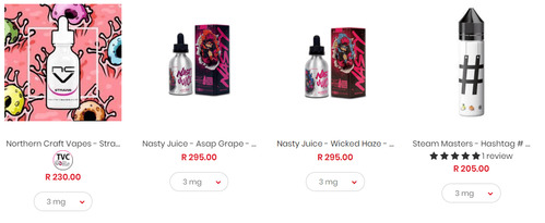
I have decided to partner up with @Chanelr from TVC, I have modified the website a bit to accommodate some great unbiased reviews.

So, from now on you will see the following when a product contains a review:

upload_2019-1-29_14-50-47.png

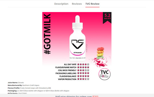
Notice the TVC logo? That tells you there is a professional review available. once you enter the product you will see the following:
upload_2019-1-29_14-52-22.png
You can now select the "TVC Review" tab to quickly read through the review.
upload_2019-1-29_14-53-17.png

I hope this will make things easier when selecting a new juice to try out!
 

Attachments

  • upload_2019-1-29_14-50-31.png
    upload_2019-1-29_14-50-31.png
    69.4 KB · Views: 10
So another update, but not so small.

I have decided to partner up with @Chanelr from TVC, I have modified the website a bit to accommodate some great unbiased reviews.

So, from now on you will see the following when a product contains a review:

View attachment 157163

Notice the TVC logo? That tells you there is a professional review available. once you enter the product you will see the following:
View attachment 157164
You can now select the "TVC Review" tab to quickly read through the review.
View attachment 157165

I hope this will make things easier when selecting a new juice to try out!
Thanks for the opportunity, really excited about it :happy:
 
@Pho3niX90 I have to say I LOVE the fact you do Zapper on your website! Winner Winner Chicken Dinner!
I have to say that the influx of payments via Zapper does show that this is the preferred method of payment across the board. I just wanted to make sure there are as much choice in payment methods as there are in products :)
 
Back
Top