The Vape Den - Judge our website :)

Pho3niX90

Experienced Vaper
Supporting Vendor
LV
19
 
Joined
29/6/18
Posts
244
Awards
19
Age
34
Location
Montana Park
So after reading through all the brilliant suggestions made by the community here, I have decided to make some changes, some subtle, and some major.

So the website is still very infant in regards to the development lifecycle, so knowing what works and what doesn't takes some time, luckily you guys made it a bit easier :)

So I am going to start by explaining how the website works, and the technologies behind it.

If you are able to take your time to give your input on each of these main pages, good or bad it would be highly appreciated as it will help the website grow.

To start of, the website implements image compression and lazy image loading. What the latter means is that it only loads images that is in view, and only loads images once page is rendered. This speeds up the experience and decreases unnecessary "data" costs. That being said, if anyone experience slow loading please get in touch, as I am lucky to have 100mb fiber.

First, the header
upload_2019-1-13_19-13-36.png

Now our categories are extremely limit to what I believe is efficient. My aim here was not too have too much categories that you spend 10 minutes browsing through and overlooking the actual one you want. They are self explanatory in nature. But will explain 2 below as it was mentioned.
  • What's New
    - This is obviously whats new, now the problem with the main software we use "Shopify", is that there is no easy method of showing this without causing tons of maintenance.
    - Easy method: List all products in a ascending order of date created. This gives you the entire catalog of products, listed from newest to oldest. The good? It's semi automatic making it up to date. The bad? hundreds of pages of products.
    - Maintenance method: Tag each product with "new", and then remove that tag on a weekly basis by checking which products were tagged :( Now this is very repetitive and sometimes this tag can be forgotten.
    - Custom: I will have to plug into the API of the software and automate the entire process, as I have done wit the new tag on products (a new flag will be on a products image for 30 days). Now this will take some time as the api is very limited, and it being shopify I do not have access to the source code.
  • Sale
    This is where our sale items are :) Following the maintenance method, however why its plausible here is because a sale on an item only last as long as the item is in stock, on the next stock delivery I have no choice but to update it.
  • The search bar
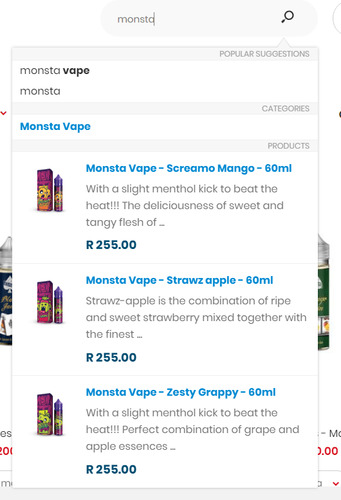
    I have spent multiple hours making the horrid standard search bar more helpfull, as it should be. It will search both the description, title, pages, sku codes, and collections, making the suggestions more fluent. If you accidentally have a typo it will try an auto correct similiar to that of google. See below
    upload_2019-1-13_19-30-3.png
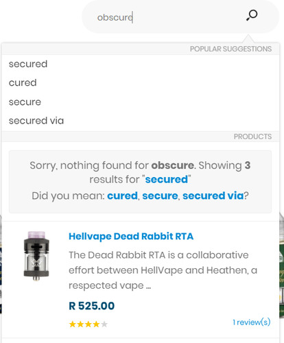
    There is still a downside, if you search for something it cannot find, it will try and change your search phrase to something that is in the sites dictionary, example below:
    upload_2019-1-13_19-31-50.png
    this is not deliberate and I am not trying to force sell you anything :)

Now onto the homepage
I spent a lot of time debating on what the homepage should be like. This is where most people land (and always for returning customers). Taking that into consideration, I opted to show products here. They are of 3 categories, eliquid, wire & coils, and cotton. Why? They are my biggest categories and also what we as vapers buy most. Also, from this page you will immediately see whats new as well (limited to 24 products per category).

You will also be able to add products straight to your cart from here, by hovering over it you will have access to all options (nic strenght, mint, color ect). You can also add the product to your whishlist, add it to compare (probably a useless feature) and a quickview, see example
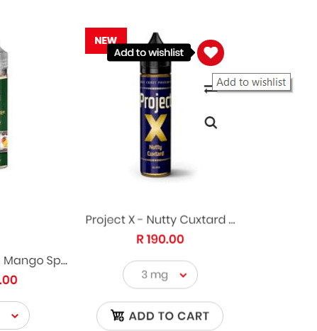
upload_2019-1-13_19-44-47.png


Next up our collection/category views

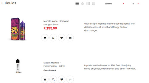
By default products are displayed in a grid view, but for those that require more detail you can switch to detailed list view, see below:

Grid view
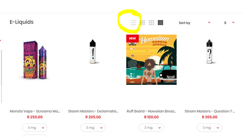
upload_2019-1-13_19-49-22.png

List view
upload_2019-1-13_19-49-52.png


Now this covers technically most of the functionality that one would need.

Now things that need to happen are as follows:

  • Popups
    I have now removed all popups that aren't beneficial to the user.
  • Too much activity
    I have tried to keep the website in line with "less is more", barring the homepage.
  • Complicated checkout
    I have kept this as simple as the software allows me. In the past I allowed guest checkouts, however this made users lose their loyalty point (since they are a guest), and having to fillout all their delivery details each time. an account is now forced to make sure this doesn't accidentally happen. So on your second checkout it should be super simple.
  • Needing to go to product page to see juice profile
    I believe this is now fixed with the list view, what do you think?
  • Clear pictures
    I try to keep the photos to a certain standard, however, there is some interesting equipment on the way that will make the photos exceptional. I cannot say much now, but once it arrives be prepared for a new way of virtual shopping :D
  • Product name and price
    The current naming convention is as follows:
    Brand - Juice name - milliliter
  • Good search
    I hope this is now resolved :)
  • filter out of stock
    This will be an option hopefully in the near future.
  • ETA's on when stock will arrive
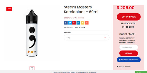
    Along with the preordering of the website, I was able to tap into some apis to make the ETA's display under the buy now button. This is what you will see on an out of stock product
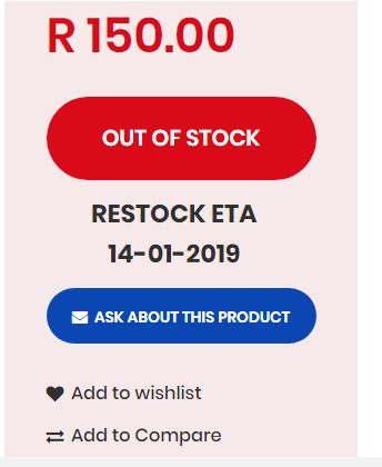
    upload_2019-1-13_20-0-33.png
  • Stock QTY
    This currently not possible with shopify, since they completely removed this functionality. But will probably introduced by tapping into the inventory API in the near future.
  • Related items
    This is currently implemented :)
  • Better descriptions that include the PG/VG ratio
    I will have to revisit all products and include this. But it will be done
  • Address, phone number, email present
    Everything is present currently on the homepage, barring the address. I have had a few people pitch up in the past thinking it's a brick and mortar store, however this is included on the invoice and as always, I provide the address on request.

This was a lengthy thread, and if you took the time to read through all of that, then I thank you!
 

Attachments

  • upload_2019-1-13_19-29-40.png
    upload_2019-1-13_19-29-40.png
    35.5 KB · Views: 8
  • upload_2019-1-13_19-31-47.png
    upload_2019-1-13_19-31-47.png
    19.7 KB · Views: 7
Great feedback @Pho3niX90

I think your website is great. Clean and easy to read and navigate
The way you are thinking about it shows that you care about your customers and making their experience better.
That is a big win.

Wishing you all the best with the website changes from here on and hope it translates into lots of success.

:campeon:
 
Oh, what a breath of fresh air! A vendor that takes suggestions and implements them! Bazinga!

The speed of web site - Perfect!
What's New - Perfect!
The range of products - Great to see items not available at all the rest of the Vendors!
Out of Stock warning - Perfect!
Free Shipping - Fantastic the way it tells you!
Menu System - Simple and easy!
Red Pill in stock - Major Fail! :)
Colour section system - Great!
Checkout and Payment - Slick and perfect!

I was so excited to see a great web site I ordered enough stuff to get free shipping! @Pho3niX90 you have done an excellent job!
Thank you for your support, and kind words :)

I will have to stock redpill real soon :)
 
Im in cpt and this is my number 1 online store. Well done to everyone at the vape den, also the customer service is spot on.
 
Thank you for your support, and kind words :)

I will have to stock redpill real soon :)
From what I just read it seem you had the better website right now.
Thanks to taking the time to explain what you did and how it works.
I hope this is adapted for android and windows mobile so we can browse and shop on the go.
Good work and well done!
 
Been there an it works well on android. No hassles and pages load
Nice and easy.all the relevant info is also easily accessible. Nice job!
 
@Pho3niX90

Before even looking at your website, I like your attitude. You came across that thread about vendors' websites and within a day or two you made changes to yours. Furthermore, you didn't do it discreetly. You then came back to the forum and asked us to judge your site. It's not easy to put yourself out there, but you've done it.

All of the above show me some important things about you, before I even look at the site.
  • You're willing to be judged.
  • You're willing to adapt.
  • You're totally service-oriented.
You deserve a upload_2019-1-13_21-34-3.jpeg


Now for the site.

The Good

  • I absolutely love the layout of your site! It's clean and uncluttered.
  • Half-price shipping for orders over R300. Excellent! R300 is more than reasonable. Thank you for being so generous!
  • I love the "Nasty Juice - Don't Fake Up!" What a clever idea to include information about fake Nasty Juice.
The Bad

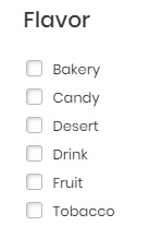
  • There's a spelling mistake. "Desert" should be "Dessert"
upload_2019-1-13_21-10-52.png


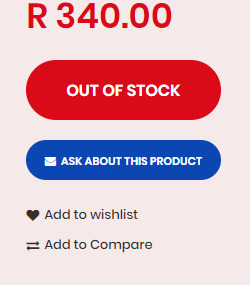
  • In your explanation of the website, you stated that out-of-stock products would have an ETA, but this one, Hazeworks - Custard Cloud - doesn't.

upload_2019-1-13_21-41-53.png

It has "Ask about this product" instead of an ETA.

  • My feelings about "Ask about this product" are mixed. Yes, it's great that you provide that option, which I don't recall seeing on any other vendor's site. On the other hand, when I'm shopping online at 3 .m. it doesn't help much right then. If you're not likely to get stock then perhaps remove the product. If you are definitely getting stock but you can't give a date, then perhaps say ETA TBA (ETA to be advised). Just a thought ...

  • Sometimes I feel as if I'm hallucinating. I see things on the site and then suddenly they're gone. Am I going crazy? For example, the message about half-price shipping if the order is over R300 is there one minute and gone the next - and then a scroll or two later it returns. Oh my, I've gone down a rabbit hole here, I think!
  • As I scroll down, the items move and I find that really tiring on the eyes.
  • It would be helpful to have an Add to Wish List as well as Add to Cart with each item.
The Ugly

You don't have a coffee which I don't have lol. I'm always searching for new coffees for
https://www.ecigssa.co.za/coffee-e-juice-research.t47247/#post-638125.

The "I Have" list in the thread above needs to be updated, but if you find any coffees percolating somewhere, please let me know. If I don't have it I'll definitely order it!


As I said at the beginning, I love your attitude, @Pho3niX90 and I wish you great success and joy with your business.
 

Attachments

  • upload_2019-1-13_21-33-14.jpeg
    upload_2019-1-13_21-33-14.jpeg
    3.5 KB · Views: 5
Having read through this thread I am ashamed to say I have never bought from The Vape Den,nothing personal against you @Pho3niX90 ,it's just now lately I'm broke so waiting for that to change :)
 
My first time using your website and it was super easy to navigate. To find what i'm looking for and to pay.

Probably the best online vaping retail website currently in SA that i've used. Well done @Pho3niX90 keep it up.

PS.. The Shado OMNI is Awesommmmeeeee.. :D
 
I’ve only ordered once from you, but I definitely plan to become a regular customer of yours!! I really like that you’re active here on the forum, your website is great, I love that you have a good variety of items and I feel like I can approach you if I have any questions or concerns. 5 star rating! :)
 
Im in cpt and this is my number 1 online store. Well done to everyone at the vape den, also the customer service is spot on.

Agreed with this, also in CT and try use Vape Den for everything

Amazing work on the website and just exceptional customer service throughout
 
@Pho3niX90 from the first day of reading your vendor intro and then doing business with you I instantly knew customer service was the number one business goal.

Your website has always impressed me, easy of use has always been important. And yes we are all blessed to have so many great vendor both walk-in stores and online stores but with The Vape Den being only online I still get the same walk in store experience as you are always available to take my call or WhatsApp messages.

You forgot to mention and for those how did not notice - The Vape Den has a awesome rewards program!

I for one enjoy the fact that we get rewards for our review of products purchased from The Vape Den. So not only am I incentivized, I am also able to read reviews from others that help making informed purchasing decisions, especially when it comes to eJuices. So come on peeps, write review for your purchased products, it helps us all and the vendor to know what’s hot and what’s not.

And @Pho3niX90 - thanks bud for helping me find and purchase the “perfect” vape products. I have found my happy place and I have only been vaping since June 2018.
 
Last edited:
i have always liked your website and found it without any issues.
a nice to have would be "tooltip texts" that state the flavour profile of a juice when you hover over it without having to drill down to the product description. because everyone clearly knows that "three stripped zebra" is strawberries with ice.
 
@Pho3niX90

Before even looking at your website, I like your attitude. You came across that thread about vendors' websites and within a day or two you made changes to yours. Furthermore, you didn't do it discreetly. You then came back to the forum and asked us to judge your site. It's not easy to put yourself out there, but you've done it.

All of the above show me some important things about you, before I even look at the site.
  • You're willing to be judged.
  • You're willing to adapt.
  • You're totally service-oriented.
You deserve a View attachment 155789


Now for the site.

The Good

  • I absolutely love the layout of your site! It's clean and uncluttered.
  • Half-price shipping for orders over R300. Excellent! R300 is more than reasonable. Thank you for being so generous!
  • I love the "Nasty Juice - Don't Fake Up!" What a clever idea to include information about fake Nasty Juice.
The Bad

  • There's a spelling mistake. "Desert" should be "Dessert"
View attachment 155787


  • In your explanation of the website, you stated that out-of-stock products would have an ETA, but this one, Hazeworks - Custard Cloud - doesn't.

View attachment 155790

It has "Ask about this product" instead of an ETA.

  • My feelings about "Ask about this product" are mixed. Yes, it's great that you provide that option, which I don't recall seeing on any other vendor's site. On the other hand, when I'm shopping online at 3 .m. it doesn't help much right then. If you're not likely to get stock then perhaps remove the product. If you are definitely getting stock but you can't give a date, then perhaps say ETA TBA (ETA to be advised). Just a thought ...

  • Sometimes I feel as if I'm hallucinating. I see things on the site and then suddenly they're gone. Am I going crazy? For example, the message about half-price shipping if the order is over R300 is there one minute and gone the next - and then a scroll or two later it returns. Oh my, I've gone down a rabbit hole here, I think!
  • As I scroll down, the items move and I find that really tiring on the eyes.
  • It would be helpful to have an Add to Wish List as well as Add to Cart with each item.
The Ugly

You don't have a coffee which I don't have lol. I'm always searching for new coffees for
https://www.ecigssa.co.za/coffee-e-juice-research.t47247/#post-638125.

The "I Have" list in the thread above needs to be updated, but if you find any coffees percolating somewhere, please let me know. If I don't have it I'll definitely order it!


As I said at the beginning, I love your attitude, @Pho3niX90 and I wish you great success and joy with your business.
Thank you very much for your kind words, and taking the time to give me such an in dept report :)

  • I will have to fix that spelling mistake asap! Cannot believe I overlooked it :(
  • There are some items which do not have an ETA right now, reason for this most of the time is that they aren't currently on order. Or it might be that they just went out of stock in the last couple of days and hasn't been reordered as yet. I will add in an estimation on reorder on items such as this as well as there is enough data to give a plausible prediction on the next order date. For items that hasn't been restocked in the last 6 weeks (exception for international products), they will be discontinued.

    One issue about removing items completely from the store is that it will suffer tremendously when google can no longer find the page on the next crawl, and will mark the site with having "Broken links". That being said, I will find a way to at least hide it from the customs view :)
  • The "ask about this product" is there permanently there, this comes i handy when you for example have a question about a specific wire or coil, which the description cannot answer, however more often than not the live support solves this issue as well :) Yesterday I added in a Q&A section as well on products, this will keep all common questions and answers grouped by product with the reviews :)
  • Regarding the free shipping bar, I had a look on mobile and see exactly what you mean, and it's no good and needs fixing.
  • Regarding the items that move while scrolling. Does it seem like the web page is trying to resize? Or is it the images that populate? Does this happen when you scroll back up again as well? Which device are you using when this happens? Sorry for these questions :(
  • Currently all of them do have the add to wishlist, however do notice that on mobile from the catalogue view, the option is not there, I will add it in ASAP :)
  • As for the half priced shipping and free shipping. I thought it was best to have 2 goals instead of one. When I was still buying my goods from other vendors before TVD started, it always felt like I was being strong armed to buy more than I actually wanted, to get to that free shipping option. Although now I know why it's done. However I felt there should at least be another option where the shipping fee is halfed (R25 for gauteng, R50 for the rest of SA).
  • And then, I will read through your thread, and find some coffee juices you haven't tried before :)
Thank you very much for your input, this is the type of stuff money cannot buy. Valuable user input!
 
i have always liked your website and found it without any issues.
a nice to have would be "tooltip texts" that state the flavour profile of a juice when you hover over it without having to drill down to the product description. because everyone clearly knows that "three stripped zebra" is strawberries with ice.
This is brilliant! I will definitely be looking into this
 
Thank you very much for your kind words, and taking the time to give me such an in dept report :)

  • I will have to fix that spelling mistake asap! Cannot believe I overlooked it :(
  • There are some items which do not have an ETA right now, reason for this most of the time is that they aren't currently on order. Or it might be that they just went out of stock in the last couple of days and hasn't been reordered as yet. I will add in an estimation on reorder on items such as this as well as there is enough data to give a plausible prediction on the next order date. For items that hasn't been restocked in the last 6 weeks (exception for international products), they will be discontinued.

    One issue about removing items completely from the store is that it will suffer tremendously when google can no longer find the page on the next crawl, and will mark the site with having "Broken links". That being said, I will find a way to at least hide it from the customs view :)
  • The "ask about this product" is there permanently there, this comes i handy when you for example have a question about a specific wire or coil, which the description cannot answer, however more often than not the live support solves this issue as well :) Yesterday I added in a Q&A section as well on products, this will keep all common questions and answers grouped by product with the reviews :)
  • Regarding the free shipping bar, I had a look on mobile and see exactly what you mean, and it's no good and needs fixing.
  • Regarding the items that move while scrolling. Does it seem like the web page is trying to resize? Or is it the images that populate? Does this happen when you scroll back up again as well? Which device are you using when this happens? Sorry for these questions :(
  • Currently all of them do have the add to wishlist, however do notice that on mobile from the catalogue view, the option is not there, I will add it in ASAP :)
  • As for the half priced shipping and free shipping. I thought it was best to have 2 goals instead of one. When I was still buying my goods from other vendors before TVD started, it always felt like I was being strong armed to buy more than I actually wanted, to get to that free shipping option. Although now I know why it's done. However I felt there should at least be another option where the shipping fee is halfed (R25 for gauteng, R50 for the rest of SA).
  • And then, I will read through your thread, and find some coffee juices you haven't tried before :)
Thank you very much for your input, this is the type of stuff money cannot buy. Valuable user input!

@Pho3niX90

Once again, I love your attitude and thanks for explaining why certain things are the way that they are.

The problem is that only people who have read your explanations would know, which means only some people on the forum. What about the others and what about people who aren't on the forum? Just a thought ...

To answer your questions:
  • I was using my laptop, not mobile.
  • Don't fret about not having seen the spelling mistake. We don't see our own mistakes; instead we see what we expect / want to see! Happens all the time!
  • You said, "One issue about removing items completely from the store is that it will suffer tremendously when google can no longer find the page on the next crawl, and will mark the site with having "Broken links". That being said, I will find a way to at least hide it from the customs view :)"
Interesting! So in other words if a product is discontinued you have to keep it on your website, either visible or hidden, forever?? Sounds utterly ridiculous, but ... Google rules the world :(

  • The items that move while scrolling:
I was on the laptop, using the mouse. By the way, I've just looked at your site again in case there had been a technological glitch yesterday, but it's the same - a moving experience lol.

I place the cursor somewhere on the page - doesn't matter where - and I scroll, using the mouse wheel.
Whichever item the cursor goes across, shifts position - it goes higher than the other items in the same row or column.
This happens whether I scroll vertically (up and down) or horizontally (left to right or vice versa).

I guess you've set it up like that so that the emphasis is on a particular product when the cursor is over it, but as I said, when one is scrolling through everything it is very tiring on the eyes to have the products shifting all the time.

Are you on TeamViewer? If so I'd be happy to set up a time for you to link to my laptop and watch as it happens. Then you'll understand. Just PM me.

If you're not on TeamViewer perhaps an IT/Website person on the forum could tell you what I'm referring to, in tech terms.
 
@Hooked - I think what you're seeing is the "add to cart" button coming in to view when you hover your mouse over the product. ;)

@Pho3niX90 - 20 out of 10 for the website. With just a quick browse I can see where I'll probably be buying my next (and future) vape goodies online. You have most of what I'm looking for conveniently placed in one VERY tidy website. Well done!
 
@Pho3niX90

Once again, I love your attitude and thanks for explaining why certain things are the way that they are.

The problem is that only people who have read your explanations would know, which means only some people on the forum. What about the others and what about people who aren't on the forum? Just a thought ...

To answer your questions:
  • I was using my laptop, not mobile.
  • Don't fret about not having seen the spelling mistake. We don't see our own mistakes; instead we see what we expect / want to see! Happens all the time!
  • You said, "One issue about removing items completely from the store is that it will suffer tremendously when google can no longer find the page on the next crawl, and will mark the site with having "Broken links". That being said, I will find a way to at least hide it from the customs view :)"
Interesting! So in other words if a product is discontinued you have to keep it on your website, either visible or hidden, forever?? Sounds utterly ridiculous, but ... Google rules the world :(

  • The items that move while scrolling:
I was on the laptop, using the mouse. By the way, I've just looked at your site again in case there had been a technological glitch yesterday, but it's the same - a moving experience lol.

I place the cursor somewhere on the page - doesn't matter where - and I scroll, using the mouse wheel.
Whichever item the cursor goes across, shifts position - it goes higher than the other items in the same row or column.
This happens whether I scroll vertically (up and down) or horizontally (left to right or vice versa).

I guess you've set it up like that so that the emphasis is on a particular product when the cursor is over it, but as I said, when one is scrolling through everything it is very tiring on the eyes to have the products shifting all the time.

Are you on TeamViewer? If so I'd be happy to set up a time for you to link to my laptop and watch as it happens. Then you'll understand. Just PM me.

If you're not on TeamViewer perhaps an IT/Website person on the forum could tell you what I'm referring to, in tech terms.
Thank you so much, once again!

Yes I fully understand what you mean by only people visiting this particular thread and reading through everything would understand the website, therefore I would have to implement working solutions for everything, it's the only way.

Yes this is it, google uses some complex algorithm to determine which site deserves a higher ranking on the search results, this is determined by factors such as, but not limited to, page score, how many other sites link in and what their page ranks are, how healthy the site is based on broken links, meta tags, descriptions etc, as well as keywords, AMP status, how mobile friendly the site is, how fast the site loads, how large the images are, how many scripts run in the backend, how long it takes from the first render to the last load, how close buttons are to one another, etc etc etc. The list is massive!!! I tend to spend around 1-3 hours a day in the google webmasters console trying to fix issues they report, which aren't even issues sometimes but just AI glitches. And sadly, because this is being classified as a tobacco website, I cannot do any paid advertising to improve ranking.
Sadly, google has another policy, if you try to fool the crawlers to see anything different from what the end users see, your site gets blacklisted from google, fun hey :)

I was able to reproduce the moving that you describe. This is definitely fixable! And you are correct, it's to put emphasis on the product that you are viewing, however I can put in an event listener to ignore the zooming effect when scrolling. Or even better yet, have it default as zoomed.

Great stuff @Pho3niX90 and you know, what comes around goes around, so who knows, I'm sure that in the future it will be your turn to criticise (and thereby help) someone else's website. :happy:
 
@Hooked - I think what you're seeing is the "add to cart" button coming in to view when you hover your mouse over the product. ;)

@Pho3niX90 - 20 out of 10 for the website. With just a quick browse I can see where I'll probably be buying my next (and future) vape goodies online. You have most of what I'm looking for conveniently placed in one VERY tidy website. Well done!

@baksteen8168 Nope, it's the entire product that shifts up, but @Pho3niX90 is going to sort it out.
 
The only problem I have is that your website works so well, I only realize I've placed an order after I complete my payment... :--P
Well done Shaun! World-Class website!
 
Thank you so much, once again!

Yes I fully understand what you mean by only people visiting this particular thread and reading through everything would understand the website, therefore I would have to implement working solutions for everything, it's the only way.

Yes this is it, google uses some complex algorithm to determine which site deserves a higher ranking on the search results, this is determined by factors such as, but not limited to, page score, how many other sites link in and what their page ranks are, how healthy the site is based on broken links, meta tags, descriptions etc, as well as keywords, AMP status, how mobile friendly the site is, how fast the site loads, how large the images are, how many scripts run in the backend, how long it takes from the first render to the last load, how close buttons are to one another, etc etc etc. The list is massive!!! I tend to spend around 1-3 hours a day in the google webmasters console trying to fix issues they report, which aren't even issues sometimes but just AI glitches. And sadly, because this is being classified as a tobacco website, I cannot do any paid advertising to improve ranking.
Sadly, google has another policy, if you try to fool the crawlers to see anything different from what the end users see, your site gets blacklisted from google, fun hey :)

I was able to reproduce the moving that you describe. This is definitely fixable! And you are correct, it's to put emphasis on the product that you are viewing, however I can put in an event listener to ignore the zooming effect when scrolling. Or even better yet, have it default as zoomed.
"Visible Archive" for stock history and merchandise not stocket anymore.
This is a new thing,Totally original concept so use it first before its used somewhere else!
 
So some more small updates to the site.

Firstly, I know it annoyed a lot of people that the "What's New" page on vendors websites are basically the entire catalog sorted.
Previously I stated that I need to do something custom to accomplish this. I now finally found a working solution. It's not yet perfect as it's only limited to 50 new products, currently this fits my needs as I do not have more than 50 new products currently. There are still bugs/issues to this.

For the technical savvy, or those curious
To accomplish this I had to modify the liquid file and have a look at each product, check the creation date via the json string, convert that to date, substract it from the current time stamp, and then convert it to days. So basically now while it loops through (as at time of writing this, 314 products) all products, it calculates the age, and if the age is within 30 days, it displays it, otherwise it continues the "for loop". This isn't perfect at all as I am now spending time calculating 314 products age, then discarding it from the results. The perfect solution would be to filter straigt on the json and discard products to to be displayed, and only then run the loop.

Now onto a new feature
Up until now I have only restocked items that were popular in the last 7 months of operation, due to the risk of oversteeping juices, however, my customer base is growing and changing by the day, so I need to keep p with new and old trends. Instead of completely removing it from the catalog I have implemented a "remind me when in stock" feature. This serves as 2 purposes, one, it lets me know what people want, and secondly, it notifies the subscriber immediately when in stock.

It looks as follows
upload_2019-1-19_23-7-8.png

The email field would obviously be auto populated.

Onto the third change
Another thing mentioned was stock on the site, this also I have said wasn't possible. However now I have been able to tap into some API's again to get the stock values passed all away from the inventory management to the frontend. Plans are to open a triangle of fullfilment centers in Gauteng (All ready open), Capetown, and Durban, so that same day deliveries are possible across the country. So this will be modified in the future to accommodate status per province.

Currently, You will either see a "In stock status", or when the quantity left is lower than 3, it will say how many is left, as per below:
upload_2019-1-19_23-19-57.png
or
upload_2019-1-19_23-20-16.png

I will also have this display the actual quantity on hand in the future, I really do not care if competitors know how much I have in stock, as they cannot do anything with that information.

Color Legends:
Done
Partially Done
To be done
  • Popups - disabled :)
  • Too much activity - Partially fixed. @Hooked mentioned that it does mess with the eyes when scrolling. Images have been made static now. Removing much of the moving parts. The only thing left now is the moving up add to cart button.
  • Clear pictures - Something major still coming :p
  • Filter out of stock - This will be coming soon
  • ETA's on stock - this is now visible even on the home screen and categories screen under the cart button. This is only applicable when stock has already been ordered :) For the rest there is the "notify me" button :)
  • Stock left - Also done now
So almost done with most of the issues :)

Thanks to everyone that has assisted me in this journey thus far!
 

Attachments

  • upload_2019-1-19_23-18-51.png
    upload_2019-1-19_23-18-51.png
    7.4 KB · Views: 6
  • upload_2019-1-19_23-19-35.png
    upload_2019-1-19_23-19-35.png
    4.4 KB · Views: 6
Back
Top